Thursday, 21 December 2017
Photography Instagram Account
For my final project, I've created an instagram account to present my semester of work. I chose an instagram account because that's what so many people are using now to get their work noticed whether it's in fashion, leading people to their blog or to shop online or whatever. The filters that instagram has are nice when you have a good picture already and you just want a quick change. Instagram is also something that everyone my age is on multiple times a day, so exposure would be high. Please head to my account (it's private for the purpose of this class, but if you request to follow me I'll happily add you! :) called shazenphoto Happy browsing! I'd love to hear what you think about my pictures and which ones are your favorites!
Sunday, 19 November 2017
Image Manipulation- Photo Triathlon
1. CUTOFFS (3)
2) HANDBONE CONNECTED TO THE FOOT BONE (3)
3) OVER AND UNDER (first is overexposed, second is underexposed)
Artist Study- Walker Evans
Artistic Study- Walker Evans
Walker Evans, born in 1903, was a very influential artist. He perfected the use of his equipment to
deliver perfectly clear photos and his publications inspired many other fantastic
artists as well. He was able to take
pictures and really tell a story as if it was already historic documentaries or
photojournalism. This is what made him
stand out amoungst his peers. His focus
was on recording the typical American scene by taking pictures of streets,
bedrooms and people milling about, recording a visual history of American
life.
Walker Evans died in 1975, and of his 72 years, he was a photographer
for 48 of them. He was born in Missouri
and moved to New York early in life. He
traveled to Paris for a year to improve his French and then returned to New
York. His early training was in Language
Arts and had a passion for literature and poetry. He wrote short stories and essays and had
plans of making that into his career.
When he started getting into photography though, he realized he could
merge his two passions and create images unlike anyone else had. Using his training, he brought lyricism,
irony, descriptions and creativity into his photography work.
Walker was tasked with documenting small town life and attempted to
demonstrate how improvements were being made by the government during the
depression. Walker didn’t like being
given an agenda however, so he took on something much more personal to him-
capturing the essence of American life by documenting the simple and the
ordinary. In 1936, Evans was called on
to photography Alabama families for Fortune magazine, and his work was such an
incredible representation of the farmers and how they journeyed through the
Great Depression tragedy, that Evans’ “Let Us Know Pparise Famous Men” became
one of the top achievements of the 20th century American letters.
Evans had his first decade of photography work showcased in the Museum
of Modern Art in September of 1938. This
collection showed pioneers farmers, miners, war veterans and every day
people. Towns, factories, ordinary
signs, churches and houses were also depicted to highlight the Depression and
it’s effect on everyone. His portraits
he took in the subway from 1938-1941 were finally published in 1966 in a book
called “Many Are Called” included them.
Taking these subway pictures was accomplished by strapping a 35mm Contax
camera to his chest with the lens peaking out of his jacket. He photographed people in commute without
their knowledge so he could capture their unguarded, thought provoking
expressions and moods. In his words he
did this because their “guard is down and the mask is off” (The Metropolitan
Museum of Art; www.metmuseum.org).
Evans started with Contax equipment then progressed
to Polaroid SX-70 in 1973. Themanufacturer gave him an unlimited source of film to go with the camera and provided him with instant prints to critique. This camera fit his poetic vision of the world and were to be his final photographs. Using this new camera he returned to taking pictures of what made him fall in love with photography- signs, posters (and the wear and tear due to weather, neglect or war). Photography whether done as 8x10’s with elaborate equipment, or by the Polaroid instant cameras, were before post editing with computers became the norm.
Monday, 9 October 2017
Portraiture (5)
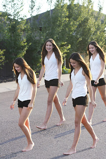
Picture 1- Option #2- Layers Portrait. I selected a few images of Jordi walking, and put them all together on one. Looks kinda cool. I'm happy with how it turned out.

Picture 2- Option #3 Filter Experiment. The four I ended up choosing were Emboss (cool effect), Solarize (she looks fierce), render (the one in the frame) and 3D normal map as it looked different but I loved it as well.
The next 2 pictures are before and after. Left is uncropped and the right one I cropped, lightened and increased the contrast. I also used the dodge tool to brighten her eyes and tried a glossy lips tutorial but it didn't look good so I ditched that.
I really made this image brighter as it seemed to look best that way, and then put words that describe her to me over top making it look a bit like a magazine cover.
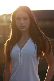
Finally, this one was actually my favorite as the sun was going down and I love the look on the back of her hair. I increased the vibrance and saturation and decreased the offset exposure to create this effect.

Thursday, 21 September 2017
Image Adjustment 1 (old woman) 2 (my mom- another old woman :)
Top Image- unedited. Bottom is edited with tutorial.
Top- before unedited. Bottom edited with tutorial.
Friday, 8 September 2017
Photography Basics Assignment
Tuesday, 13 June 2017
Introduction to Photography Assignment
The first picture I chose comes from the aerial category. Initially looking at the categories the images that come to mind are ones shot out of an airplane, or more recently, from a drone. This one was different and made me realize that shooting from a high place to something beneath the camera is also an aerial shot.
http://www.betterphoto.com/gallery/dynoGallDetail.asp?photoID=13123637&cn=Aerial-Photography&catID=27&rowNumber=8&sortBye=New&contestCatID=&camID=&mem4gall=0&favMemID=&Favpt=
This picture is from the nature category. I picked it because at first I didn't even think it looked like a photograph, but more like a painting. It was almost as if I could touch it and feel all the different textures. I also loved the flow to the water, that shows movement.
http://www.betterphoto.com/gallery/dynoGallDetail.asp?photoID=14508093&cn=Waterfall-Pictures-Water-Fall-photos-Tropical-Water-fall-Pictures&catID=495&rowNumber=3&sortBye=New&contestCatID=&camID=&mem4gall=0&favMemID=&Favpt=
http://www.betterphoto.com/gallery/dynoGallDetail.asp?photoID=494840&catID= This picture I chose for the medical category. While I find accidents/responders and the emotion on the faces of people surrounding a scene, or those working hard to assist those in trouble compelling, I chose this one because it was creative, and the close up really enhances the message it is trying to get across. The lighting was cool too.
Fashion: http://www.betterphoto.com/gallery/dynoGallDetail.asp?photoID=1620113&catID=
I love this picture because so many fashion photos are what you'd see in magazines, totally photoshopped and staged (not that this one might not be either! :)). I liked this one because the model wasn't 'trying too hard' and appears disinterested, and I love that it was a very muted palate (black and white).
Landscape pictures are so beautiful, but I especially loved this one as it has mystery, great lighting, and I like where the skyline is in the picture (not in the middle). It also looks like a place I'd like to travel to someday. http://www.betterphoto.com/gallery/dynoGallDetail.asp?photoID=13340532&cn=Winter-Scene-Pictures-and-Nature-Winter-Pictures&catID=450&rowNumber=11&sortBye=New&contestCatID=&camID=&mem4gall=0&favMemID=&Favpt=
Portraiture- I loved the picture of this little guy! You could make up so many different stories as to what he's thinking or feeling, and they'd all fit. I like that the background is blurry, but he is perfectly in focus so your eye stays on him. His one foot off the ground is adorable too. http://www.betterphoto.com/gallery/dynoGallDetail.asp?photoID=13510348&cn=Children-Photo-Gallery-Children-Pictures&catID=109&rowNumber=8&sortBye=New&contestCatID=&camID=&mem4gall=0&favMemID=&Favpt=
Wedding- So many wedding pictures are so 'posey-posey' and you see the same set up over and over. Why I chose this one, is because it's fun and although weddings are beautiful, and serious, and life changing doesn't mean they have to be stuffy. This one made me smile even though it feels tilted and the little middle flower girl doesn't look impressed.lol. http://www.betterphoto.com/gallery/dynoGallDetail.asp?photoID=13256355&cn=Great-Wedding-Photographs&catID=106&rowNumber=35&sortBye=New&contestCatID=&camID=&mem4gall=0&favMemID=&Favpt=
Automotive- I love this old truck. I chose this image because it looks like something I might find on my uncle's farm, so it made me think of family and fun times hanging out on the farm. I also love the image http://www.betterphoto.com/gallery/dynoGallDetail.asp?photoID=13123033&cn=Car-Photography&catID=249&rowNumber=8&sortBye=New&contestCatID=&camID=&mem4gall=0&favMemID=&Favpt= because it almost doesn't look real. The colors are so vibrant yet the truck and building are just plain. Oh the stories this truck could tell, I'm sure!
This image stirs up emotion for me, and makes me think of all the people that would be affected by a disaster such as fire. This just screams dread and sadness to me. http://www.betterphoto.com/gallery/dynoGallDetail.asp?photoID=13267165&cn=Picture-of-a-Fireman-911-Pictures-Emergency-etc&catID=331&rowNumber=8&sortBye=New&contestCatID=&camID=&mem4gall=0&favMemID=&Favpt=
Finally, the image I chose for product demo is a picture that doesn't even show the whole product. That's one of the things I love about this image, along with the bright colors and promise of adventure. The uneven dirt under the tires adds to the feel of the photo, and makes me want to jump on and take one for a rip! http://www.betterphoto.com/gallery/dynoGallDetail.asp?photoID=10120878&cn=Motorsports-Motocross-Pictures-Motorbike-Pictures&catID=144&rowNumber=3&sortBye=New&contestCatID=&camID=&mem4gall=0&favMemID=&Favpt=
Subscribe to:
Comments (Atom)


