Picture 2- Option #3 Filter Experiment. The four I ended up choosing were Emboss (cool effect), Solarize (she looks fierce), render (the one in the frame) and 3D normal map as it looked different but I loved it as well.
The next 2 pictures are before and after. Left is uncropped and the right one I cropped, lightened and increased the contrast. I also used the dodge tool to brighten her eyes and tried a glossy lips tutorial but it didn't look good so I ditched that.
I really made this image brighter as it seemed to look best that way, and then put words that describe her to me over top making it look a bit like a magazine cover.
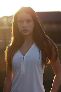
Finally, this one was actually my favorite as the sun was going down and I love the look on the back of her hair. I increased the vibrance and saturation and decreased the offset exposure to create this effect.


